Home
Projects
About me


OVERVIEW
As an international student new to BYU—Hawaii, I struggled to find off-campus housing. The search process was chaotic—scattered Facebook posts, outdated listings, and unclear communication with landlords made everything feel unreliable and time-consuming. That personal frustration became my motivation to design the Housing Panel, a centralized platform that makes finding housing easier, clearer, and more trustworthy for both students and landlords. My goal was a single, user-centered platform that integrates messaging, rent payments, and a dual-rating system.
To better understand the problem, I conducted in-depth interviews and surveys with BYU—Hawaii students and local landlords. Despite time constraints, qualitative methods revealed three major issues:
Time Drain
Students spent ~5 hours/week sifting through duplicated or outdated listings.
Information Overload
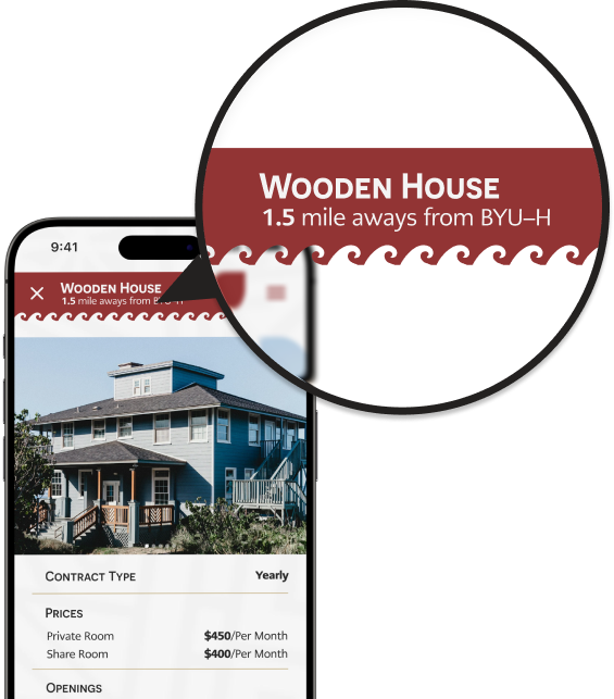
Critical details—like lease terms and property photos—were missing in most postings.
Uncertain Quality
Users had difficulty determining the reliability of landlords and the true quality of housing until after moving in.
Personas & User Journey Maps
Based on the research, I developed detailed personas (like “Sam”) and journey maps that captured the pain points—starting from endless scrolling through Facebook posts to the uncertainty of signing a lease. These tools gave me a human-centered blueprint for building a more efficient housing experience.

Sam
Age: 20
Year: Sophomore
Hometown: Hong Kong
Major: Communication
Occupation: Full-time student, campus ambassador
“I’m frustrated with listings that lack clear, verified details—I need a search tool that quickly delivers accurate info on study spaces and amenities.”
Goals:
Frustration:
Bio:
Sam is starting college and seeks a home that supports both his academic and social growth. A streamlined search with reliable details will help him find the ideal place.
Persona, Problem Statement & User Journey Map
Sam is a 20-year-old sophomore and campus ambassador at BYU–Hawaii who needs a user-friendly housing platform because he’s overwhelmed by incomplete listings and wants reliable amenities to support his academic and social life.
ACTION
TASK LIST
FEELINGS
IMPROVEMENT OPPORTUNITIES
1. Join Groups
Sam joins multiple Facebook groups, hoping to find valid off-campus listings.
Overwhelmed by scattered info and outdated posts
Create one official platform with centralized listings.
2. Compare Posts
He scrolls through incomplete or duplicate posts, messaging random landlords.
Frustrated by unclear details
Provide verified listings and clear property info.
3. Decide & Follow Up
Sam tries to finalize an option with minimal data and inconsistent replies.
Anxious about missing good opportunities
Enable direct messaging, ratings, and trusted reviews.
I used these insights to design an intuitive information architecture. For students, the priority was a robust housing search with meaningful filters (like facilities and distance to campus) and the ability to save listings. For landlords, I streamlined the listing management process and simplified communication with potential tenants.

Information Architecture
These ideas were brought to life through wireframes and a low-fidelity prototype that focused on ease of navigation and quick access to essential features.
Search Flow Wireframes

Low-Fidelity Prototype
I ran an unmoderated usability study with 5 students at BYU—Hawaii. Each session lasted 20–30 minutes and turned feedback into actionable changes.
Distance Display
Payment History
Flexible Lease Start Dates
Feedback from these sessions drove critical refinements, ensuring that both function and feel resonated with users.
With my graphic design background, I created a visual identity that balances professionalism with a warm, island-inspired vibe.
Logo
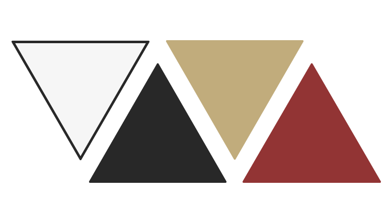
I began by breaking down the letter ‘H’ into three symbolic elements—house, wave, and Hawai‘i. These formed the foundation of the final, stylized ‘H’, where a wave-inspired stroke captures the coastal spirit, and a roof-like accent underscores the focus on housing. By merging these visual cues, I created a memorable logo that reflects both function and local identity.
#F6F6F6
#C1AC7C
#282828
#923434
Color & System
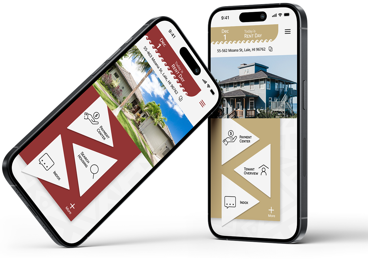
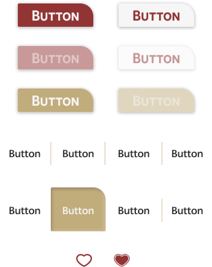
Deep crimson (#923434) and warm gold (#C1AC7C) were chosen to reflect BYU–Hawaii’s identity—but also to serve a functional role.
This dual-color system helps distinguish user roles and enhances clarity during navigation. Subtle Hawaiian motifs, such as Niho Mano (shark teeth) patterns, were integrated into the UI to honor local heritage and guide user interactions seamlessly.

Color Palette
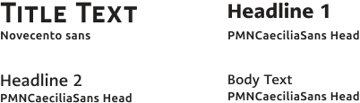
Typography
Dividers

Text Field

Progress Indicator
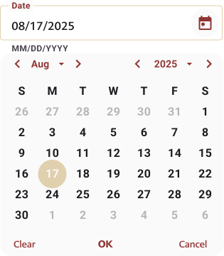
Date Picker
BYU—H Housing Panel's UI Kit
The final design delivered a comprehensive solution:
Streamlined Housing Search
Transparent Rating System
Integrated Rent Management
Landlord-Tenant Dashboard
Beta tests showed significant improvements in user engagement and overall satisfaction, validating the design direction.


A vibrant branding project for an NGO empowering young creatives, where I developed a cohesive identity with a handwritten logo, dynamic colors, and playful typography.
Role: Graphic Designer | Brand Strategist
Period: Winter 2020
This project taught me the power of designing for problems I’ve personally experienced. By listening to students and landlords, iterating through feedback, and balancing clean design with real functionality, I created a product that solves a genuine campus-wide issue. It also showed me how to work across UX strategy and visual systems to deliver thoughtful, effective solutions.

© 2025, All Rights Reserved
Next Project