Home
Projects
About me


OVERVIEW
Art tale is an NGO committed to helping teenagers and young adults discover their authentic selves through creative expression. By offering a range of art-focused courses, art tale encourages individuals to unleash their creativity, embrace their passions, and celebrate their unique voices.
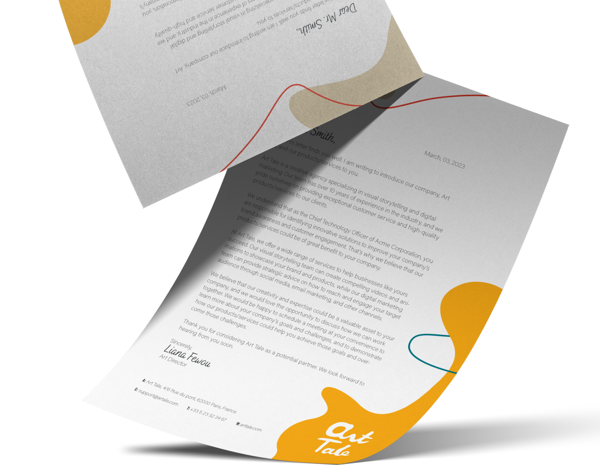
Letterhead
Letter Head
My main objective was to craft a visually empowering identity that reflects art tale’s mission to guide young people toward personal growth through art. By presenting a dynamic yet welcoming system—encompassing the handwritten logo, color palette, typography, and irregular shapes—I aimed to captivate teenagers and young adults, inspire creative exploration, and encourage them to embrace their individuality.
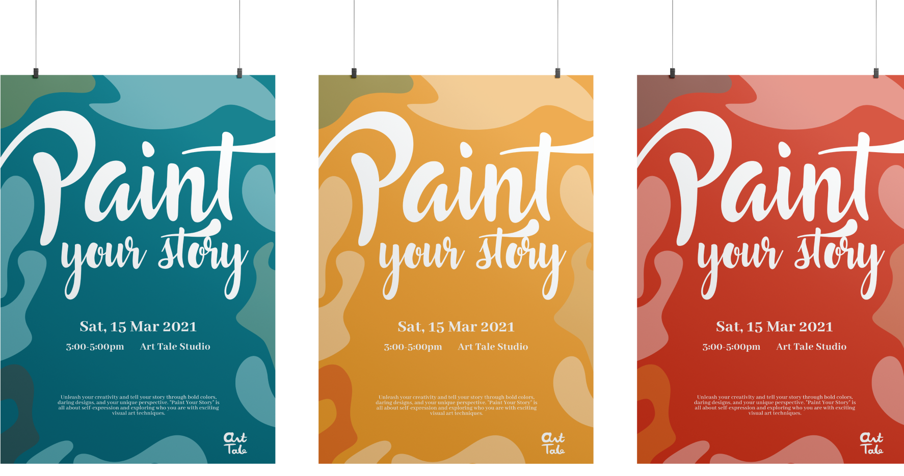
Posters
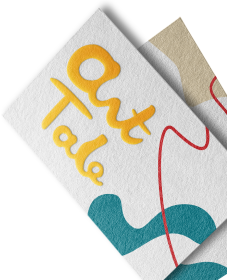
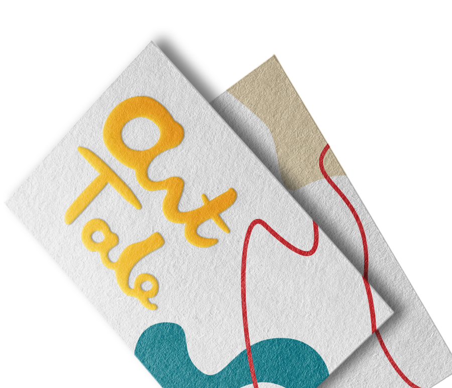
Logo
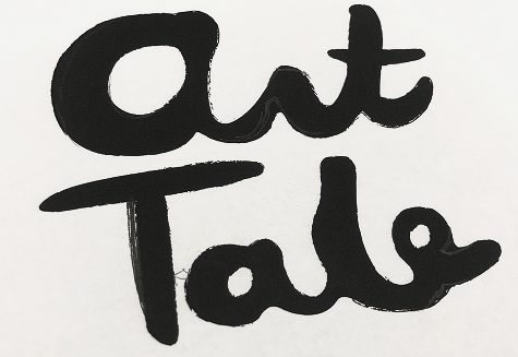
I explored a variety of hand-drawn lettering styles, experimenting with brush strokes and organic forms to reflect art tale’s playful, expressive spirit. After refining multiple sketches, I landed on this final design—a warm, free-flowing logo that captures the brand’s commitment to individuality and creative exploration.

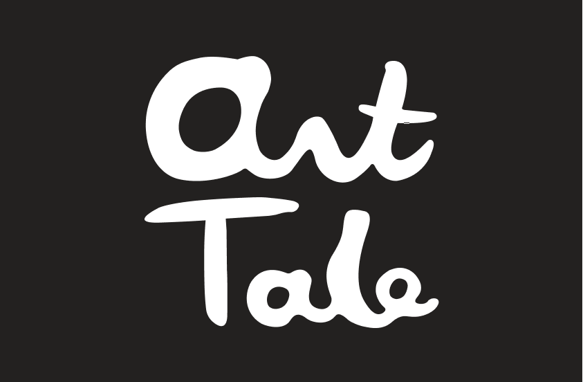
Final logo

Final logo
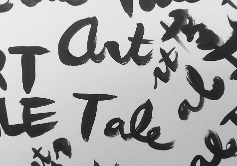
Drafts of the logo
Color Palette
In tandem, the primary color—a vibrant Golden Orange (#EDA441)—symbolizes passion and creative warmth, reflecting the boundless energy and enthusiasm that art tale aims to ignite in every participant.
To complement Golden Orange, Vermilion (#D34733) adds bold contrast, Deep Teal (#167482) provides a cool balance, and Soft Beige (#DDD0B1) keeps layouts inviting.
Visual Elements
Irregular shapes unify the brand’s visuals, each symbolizing the diverse backgrounds and creative styles of art tale’s audience. Celebrating these differences reinforces inclusivity, underscoring that every unique expression enriches the collective whole.


#D34733
RGB 211, 71, 51
CMYK 4, 93, 100, 0
#DDD0B1
RGB 221, 208,177
CMYK 12, 15, 34, 0
#167482
RGB 22, 116,130
CMYK 94, 37, 42, 9
#EDA441
RGB 237, 164, 65
CMYK 0, 42, 100, 0
Typography
Abhaya Libre serves as the brand’s principal typeface, offering clean readability across both print and digital platforms. In contrast, Bakerie Rough acts as a supporting typeface, lending a friendly, artistic edge that underscores art tale’s emphasis on imagination and self-expression.
Supporting Font
Bakerie Rough
Aa Bb Cc Ee Ff Gg Hh Ii Jj Kk Ll Mm Nn Oo Pp Qq Rr Ss Tt Uu Vv Xx Yy Zz
0123456789 !@#$%^&*()
Secondary Font
Acumin Pro
Aa Bb Cc Ee Ff Gg Hh Ii Jj Kk Ll Mm Nn Oo Pp Qq Rr Ss Tt Uu Vv Xx Yy Zz
0123456789 !@#$%^&*()
Primary Font
Abhaya Libre
Aa Bb Cc Ee Ff Gg Hh Ii Jj Kk Ll Mm Nn Oo Pp Qq Rr Ss Tt Uu Vv Xx Yy Zz
0123456789 !@#$%^&*()
Supporting Font
Bakerie Rough
Aa Bb Cc Ee Ff Gg Hh Ii Jj Kk Ll Mm Nn Oo Pp Qq Rr Ss Tt Uu Vv Xx Yy Zz
0123456789 !@#$%^&*()


Back of the business card
Seconary Font
Acumin Pro
Aa Bb Cc Ee Ff Gg Hh Ii Jj Kk Ll Mm Nn Oo Pp Qq Rr Ss Tt Uu Vv Xx Yy Zz
0123456789 !@#$%^&*()
Embracing Diverse Artistic Expressions
Art tale’s community celebrates a wide range of creative styles, which initially made it challenging to create a unified identity. I solved this by developing a flexible system of irregular shapes and bold color contrasts that adapts to various artistic expressions while maintaining a cohesive brand presence.
Balancing Professional Appeal with Creative Flair
The brand needed an identity that was both polished for professional stakeholders and playful for young creatives. I addressed this by carefully pairing a vibrant color palette with clean, legible typography, creating a design that exudes credibility without sacrificing approachability.

Stickers
Working on art tale underscored how a thoughtful design system can do more than just look appealing—it can empower a community, reflect core values, and inspire creativity. Through in-depth research, collaboration, and empathy, I learned the importance of balancing unity and individuality in a brand, ultimately creating a welcoming and inclusive experience for all.

© 2025, All Rights Reserved
Next Project