Home
Projects
About me


OVERVIEW
When Beard Papa’s finally opened in Salt Lake City, I was thrilled—it’s my go-to puff brand from Hong Kong. But once I downloaded the app, that excitement quickly faded. The interface felt generic and disconnected from the store's fun and lively atmosphere. It worked, but lacked soul. I set out to redesign the experience—bringing back the joy, personality, and clarity that loyal customers like me expect from the brand.
To better understand the problem, I conducted remote interviews and surveys with Beard Papa’s customers, including long-time fans and first-timers. Their feedback revealed three key gaps in the current digital experience:
Beard Papa’s Original App
Visual Appeal
The interface felt plain and uninspiring—lacking the playful energy and warmth customers associate with Beard Papa’s.
Product Transparency
Users were unsure about product details due to a lack of descriptions or allergen information.
Brand Connection
There was no emotional tie between the digital experience and Beard Papa’s warm, playful identity.
Competitor Analysis
I also analyzed digital experiences from Eva’s Bakery, Krispy Kreme, and Mister Donut. These brands taught me that:
Competitor Analysis
Brand
2. Krispy Kreme
3. Mister Donut
Strengths
Weaknesses
By translating the research into a detailed persona (like “Alexia”) and mapping her user journey, I uncovered the real-life frustrations and delights at each touchpoint—from app discovery to placing an order. This guided me to craft an experience that was not just functional, but empathetic to the user’s needs.

Alexia
Age: 26
Location: Salt Lake City, Utah
Occupation: Marketing Coordinator
“I love Beard Papa’s, but the app feels disconnected from their fun in-store vibe.”
Goals:
Frustration:
Bio:
Alexia is a self-proclaimed foodie who discovered Beard Papa’s through a friend. She loves the taste and atmosphere in-store but feels the app falls short of that same excitement. As a marketing professional, she notices when brand identity is inconsistent across channels, which makes her less inclined to order online.
Persona & Problem Statement & User Journey Map
Alexia is a 26-year-old marketing coordinator who needs a visually engaging order app because she finds the current design too plain and disconnected from the lively in-store vibe of Beard Papa’s.
ACTION
TASK LIST
FEELING
IMPROVEMENT OPPORTUNITIES
1. Discover
Downloads the app, expects a vibrant, engaging experience.
Curious but also hopeful that the app meets her expectations
Intro screen showcasing brand personality
2. Browse Menu & Order
-Explores product categories
-Selects items, chooses flavor options
Unsure about product details
Include detailed product descriptions and appealing images
3. Payment & Confirmation
-Enters payment details
-Waits for confirmation
Relieved the order is placed Neutral about brand connection
Provide a visually branded confirmation screen
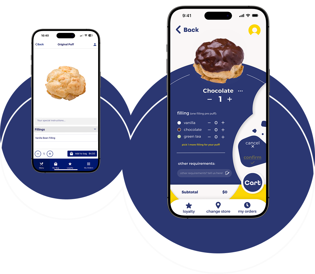
Wireframes & Low-fidelity prototype
Using the original app as a baseline, I developed wireframes focused on minimizing friction—like simplifying navigation and highlighting product visuals early in the journey. These low-fidelity prototypes helped validate layout ideas that would guide users to their favorite puffs faster, with less confusion.


Homepage Wireframe Explorations
Brand-Driven Aesthetic
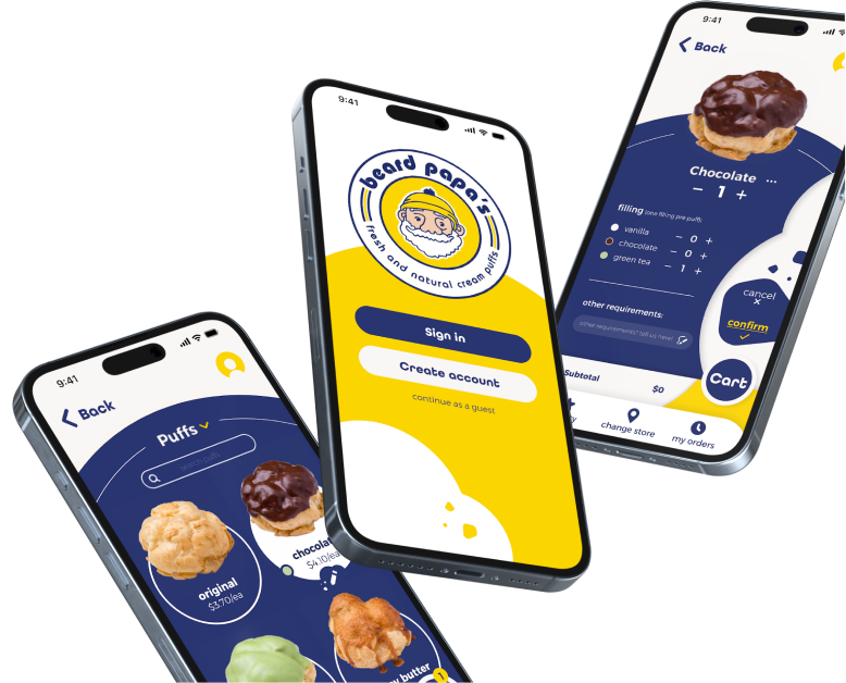
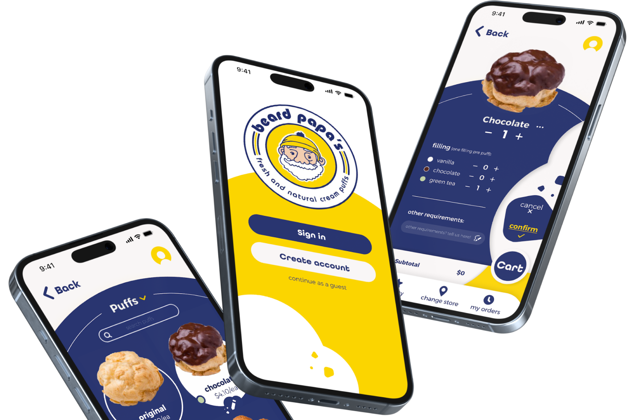
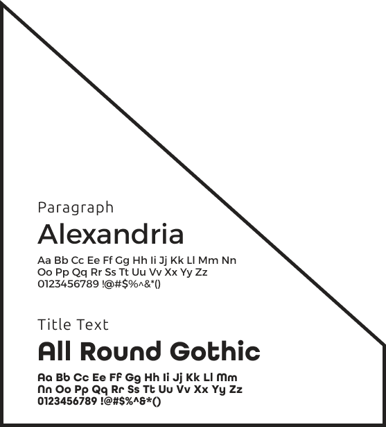
To capture Beard Papa’s playful personality, I crafted a vibrant visual system using the brand’s signature yellow (#FCD603) and deep navy (#2B3772). Yellow highlights guide attention to key actions, while navy provides a strong, reliable foundation. The typography—Alexandria for body text and All Round Gothic for headings—strikes a balance between clarity and warmth.
Visual Identity & Patterns
To reinforce the brand’s uniqueness, I designed a custom “bite mark” motif used subtly across buttons and headers. Combined with the color palette and typography, this adds a whimsical, ownable touch that brings the brand’s charm into the digital space.


#FAF7F7
#FCD603
#2B3772

Primary Font
Alexandria
Aa Bb Cc Ee Ff Gg Hh Ii Jj Kk Ll Mm Nn Oo Pp Qq Rr Ss Tt Uu Vv Xx Yy Zz0123456789 !@#$%^&*()
Title Font
All Round Gothic
Aa Bb Cc Ee Ff Gg Hh Ii Jj Kk Ll Mm Nn Oo Pp Qq Rr Ss Tt Uu Vv Xx Yy Zz0123456789 !@#$%^&*()
#2B3772
#FCD603
#2B3772
#FAF7F7

Layout & Interaction Feel
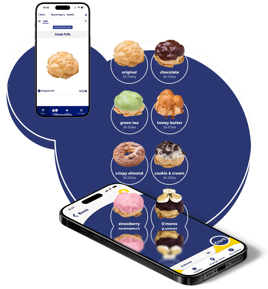
Soft curves, rounded elements, and layered card layouts introduced a friendly and modern flow. High-resolution puff images and intuitive category sections elevated scannability, making the browsing experience both delightful and efficient.

Color Palette

Typography

Text Field


Progress Indicator
Dividers
Beard Papa's UI Kit
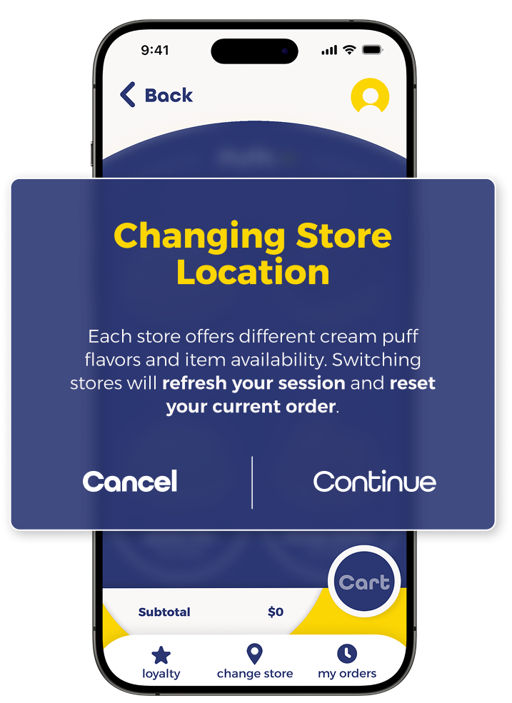
I tested the prototype with 6 users, who offered helpful insights across different features:
Store Change Alert
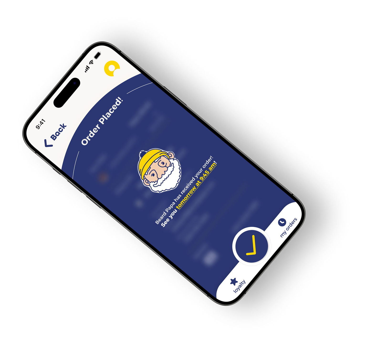
Reward Points Confirmation Screen
Unifying the Brand Experience
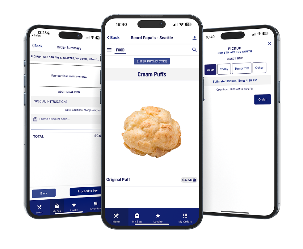
Redesigning the Menu for Better Browsing
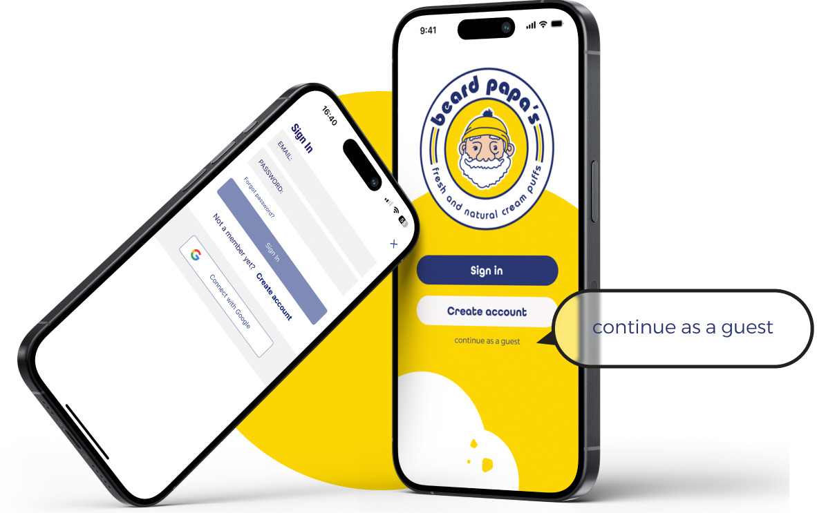
Enabling Guest Checkout for Faster Access
Introducing a Home Page to Drive Loyalty


A user-centered app for BYU-Hawaii students that streamlines off-campus housing searches with intuitive navigation and engaging visuals.
Role: UI & Visual Designer | UX Researcher
Period: Winter 2021
© 2025, All Rights Reserved
Next Project
This redesign journey taught me the importance of blending strong visuals with intuitive UX to create a truly delightful digital extension of a beloved brand. By focusing on user feedback, brand consistency, and an engaging interface, I transformed a functional but bland app into one that reflects Beard Papa’s warmth and vibrancy—encouraging loyalty and driving repeat orders. From the initial user interviews to the final tweaks in the prototype, each decision was rooted in empathy for the user and respect for the brand’s heritage. I’m excited to bring these insights—and my passion for design—to future projects, where I can continue to create experiences that resonate with users on every level.

© 2025, All Rights Reserved
Next Project